Greensboro Science Center
Partial Website Redesign
Overview
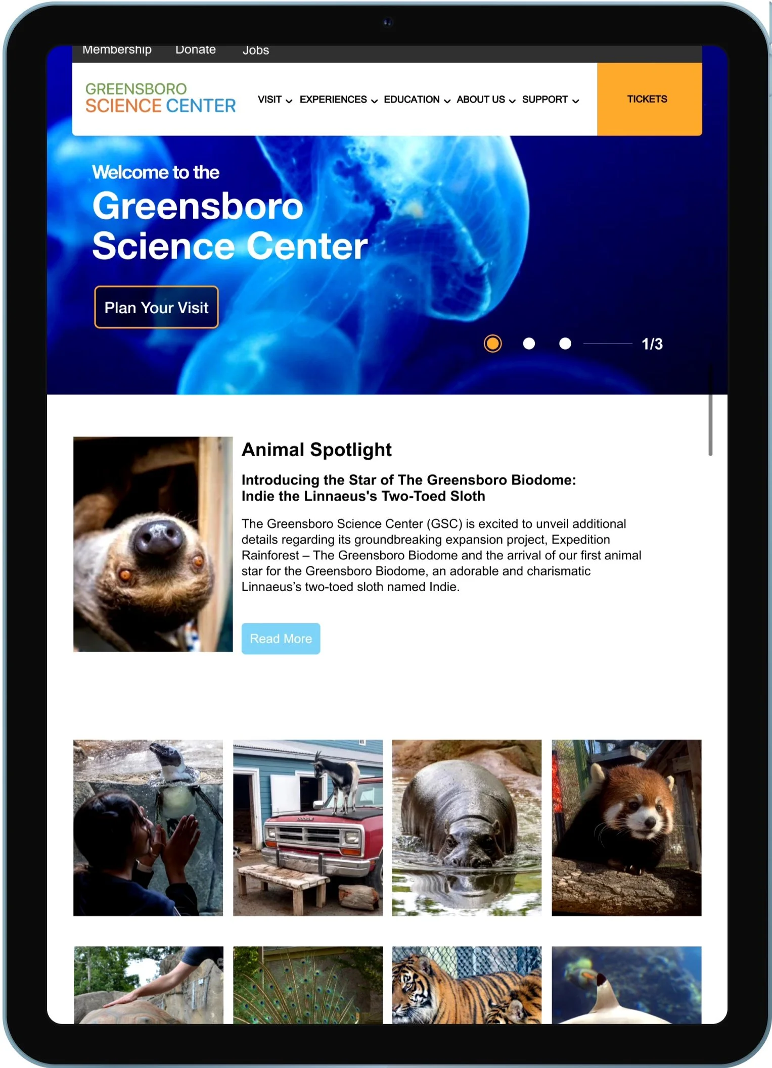
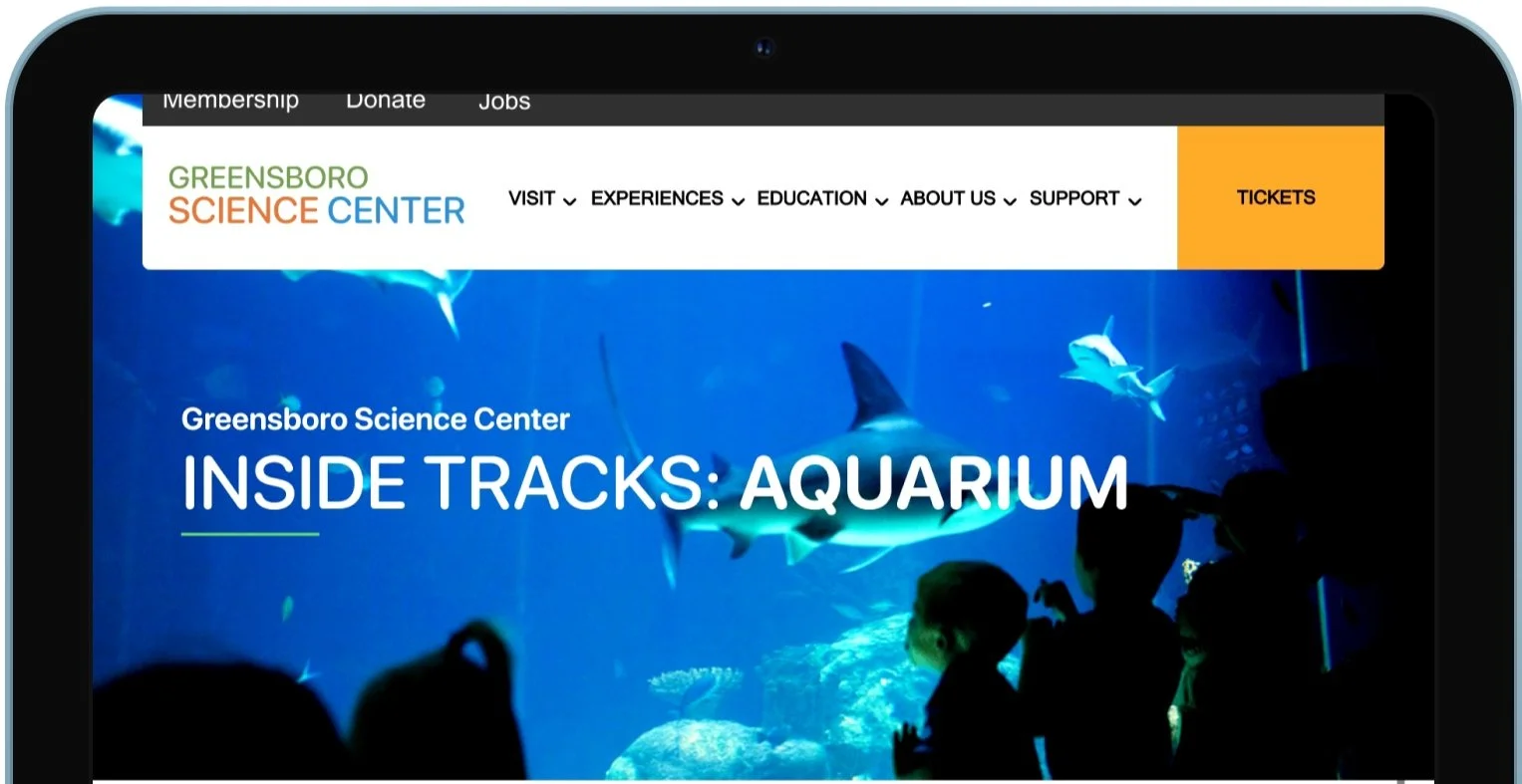
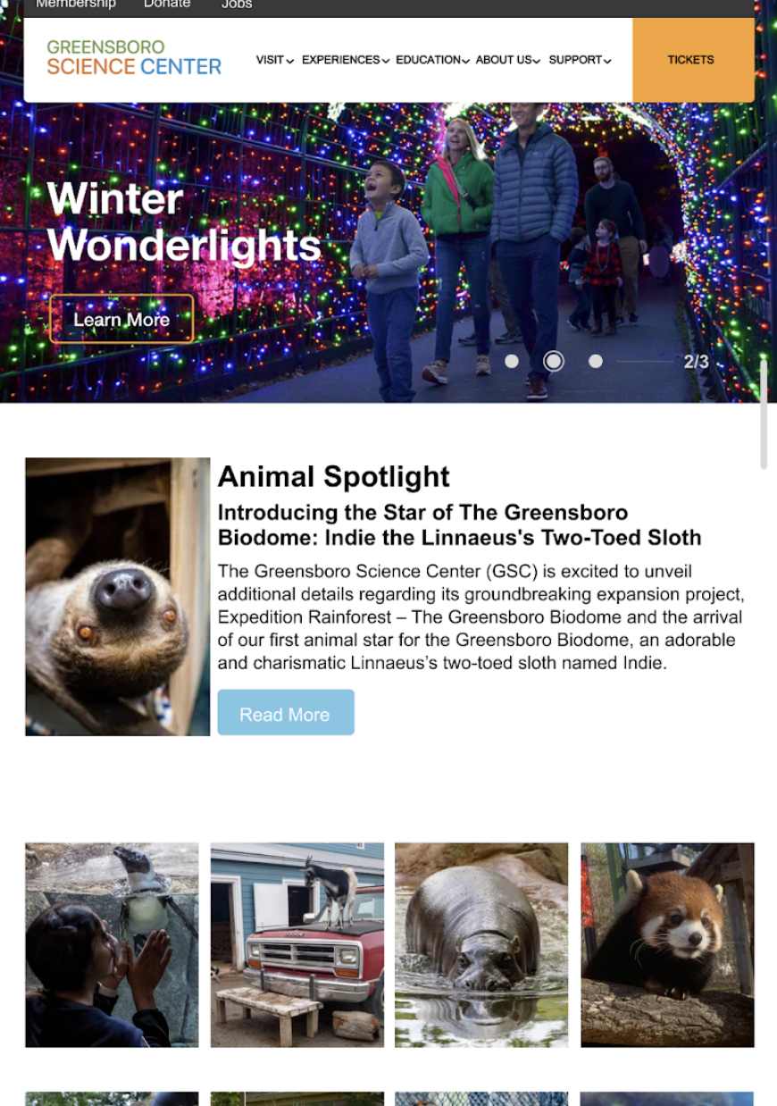
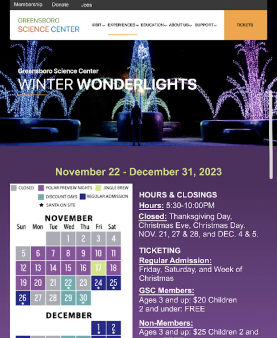
The Greensboro Science Center (GSC) is a non profit science museum and zoological park. The GSC is best known to locals as a place for field trips and a tourist attraction to people visiting the Greensboro area.
Project Goal
To redesign and improve popular user screens in order, to entice users to visit and go back to the GSC.
Figma
Miro
Adobe Photoshop
Tools & Resources
Stage 1: Interviews, Personas, and User Experience Map
Stage 2: Design & Function Requirements
Stage 3: IA Diagram, Annotated Wireframes, Preliminary Design, and Style Tile
Stage 4: Final Prototype
Stage 5: Usability Testing & Data Analysis
Process Overview
Prototype
Stage 1
Interviews
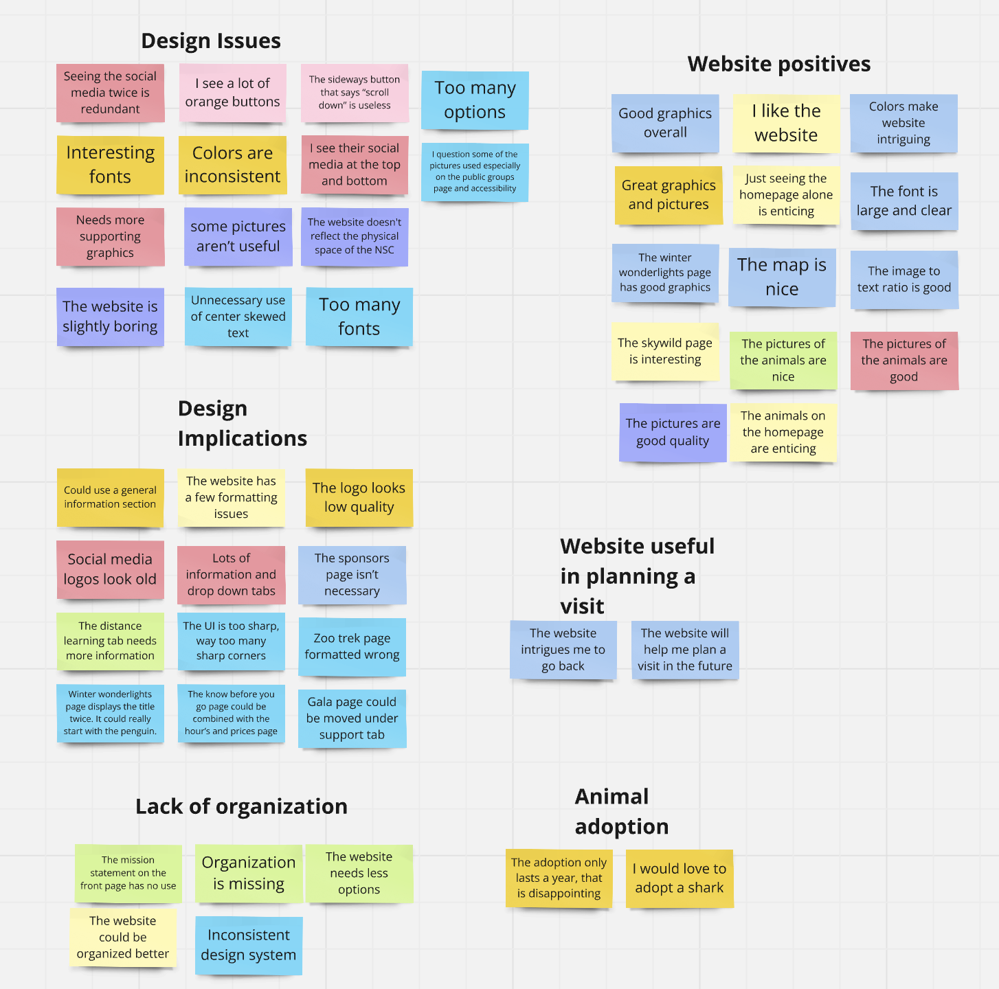
I interviewed 8 users with the goal of understanding user needs, goals, and pain points.
After synthesizing my data, I discovered these needs, wants, and pain-points:
Needs:
Clearer navigation
Less information to reduce overwhelming feelings
Easier access to trip planning information
Wants:
List of animals and their exhibits
Clearer pictures and typography
Less information per page
Pain-points:
General information is hard to locate
No pictures of physical space
Too much information on each page
Personas
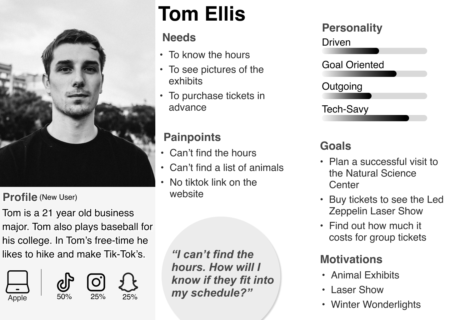
Based on the needs, wants, and pain-points, I created these two personas. One to empathize with a new user (Tom) and another to empathize with a current user of the GSC website (Lesley).
User Experience Map
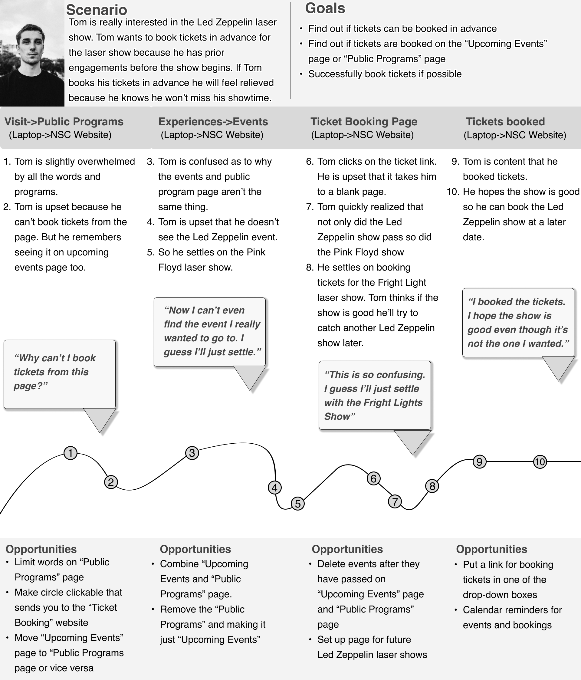
I created my User Experience Map based off of my “Tom” persona. To further empathize with the journey of a new user of the GSC website.
The UX Map left me with multiple ways to enhance user experience. I chose to focus on these two key changes:
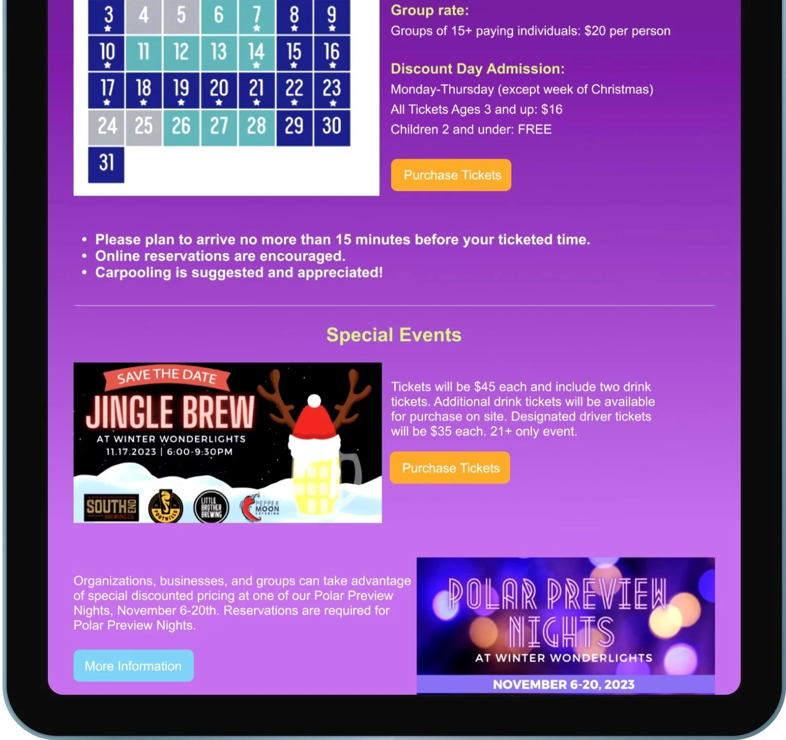
Combining the “Upcoming Events & Public Programs” page
Removing past events and creating places for future events
Stage 2
Design & Function Requirements
These are the design and function requirements I used to guide my redesign.
Fix formatting issues
Create a Style Guide
Concise Information
Design
The GSC website will allow users to easily access trip planning information
The GSC website will allow users to navigate the website without an overwhelming amount of information.
The GSC website will allow users to navigate the website intuitively
Function
Stage 3
Information Architecture Diagram
I created an IA Diagram to represent the navigational structure of the GSC website, the boxes outlined in blue are the ones I chose to focus on in my redesign.
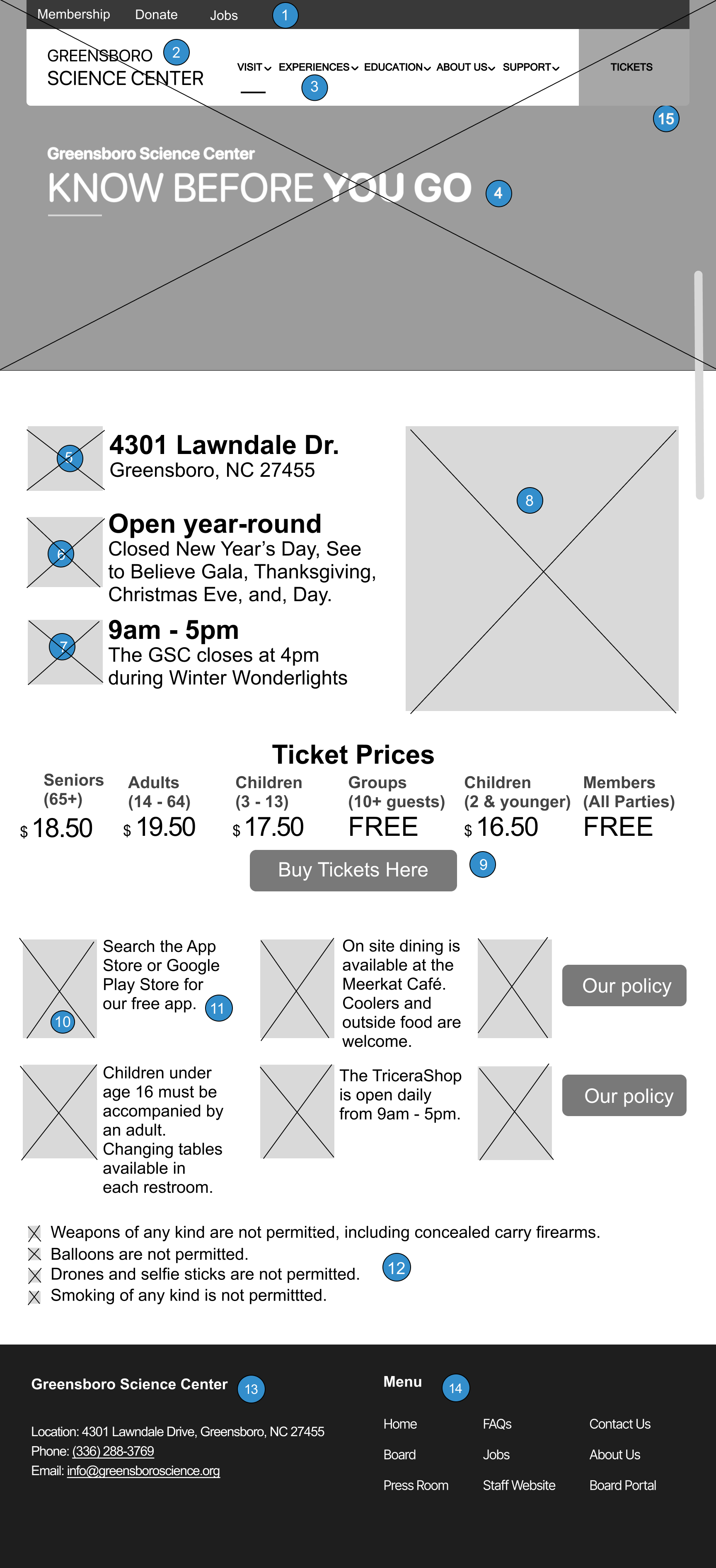
My Information Architecture Diagram does not represent a new navigational structure. It does include two new screens, “Know Before You Go,” and “Our Animals.” “Know Before You Go,” is a combination of two pages and “Our Animals,” is a completely new design.
Annotated Wireframes
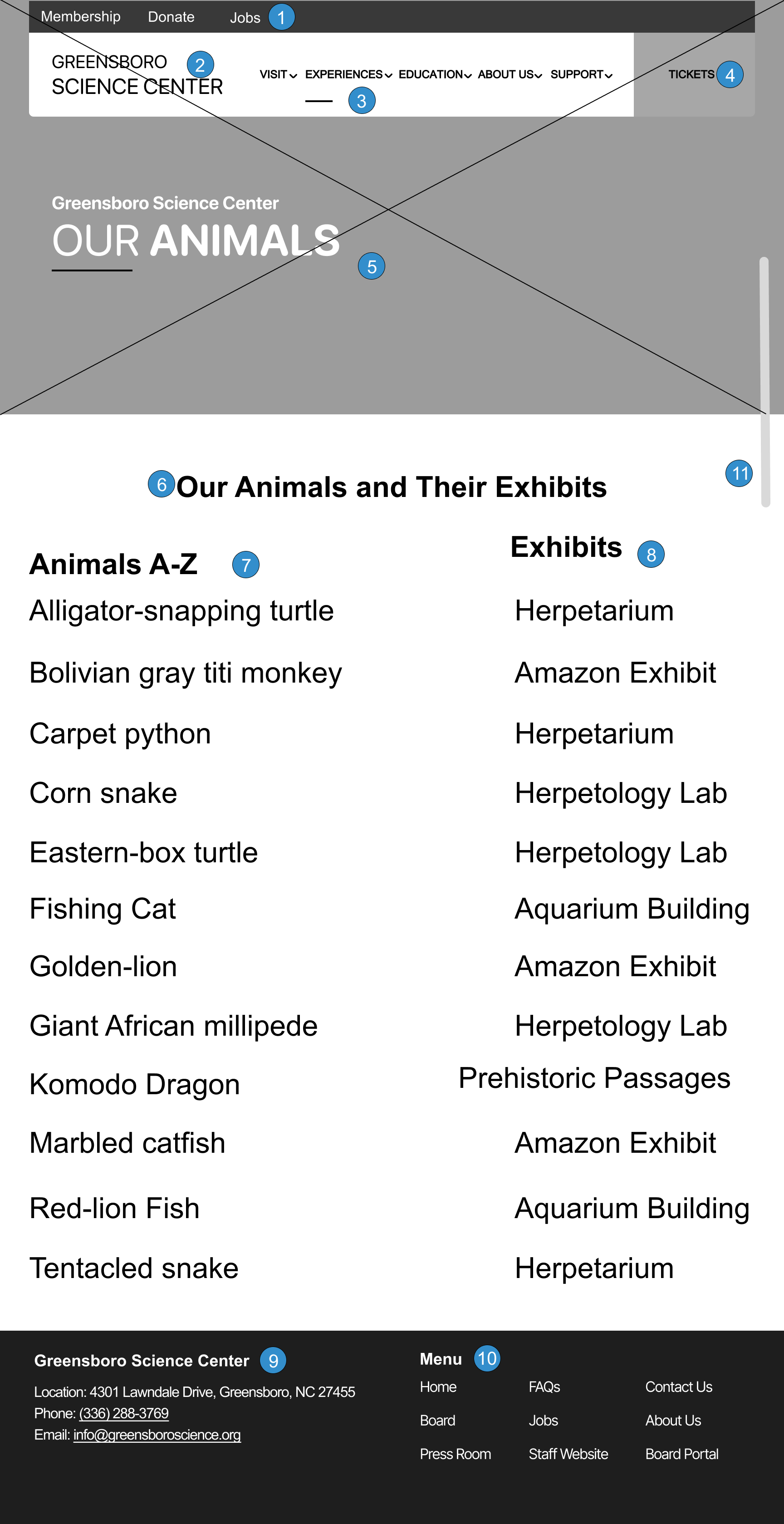
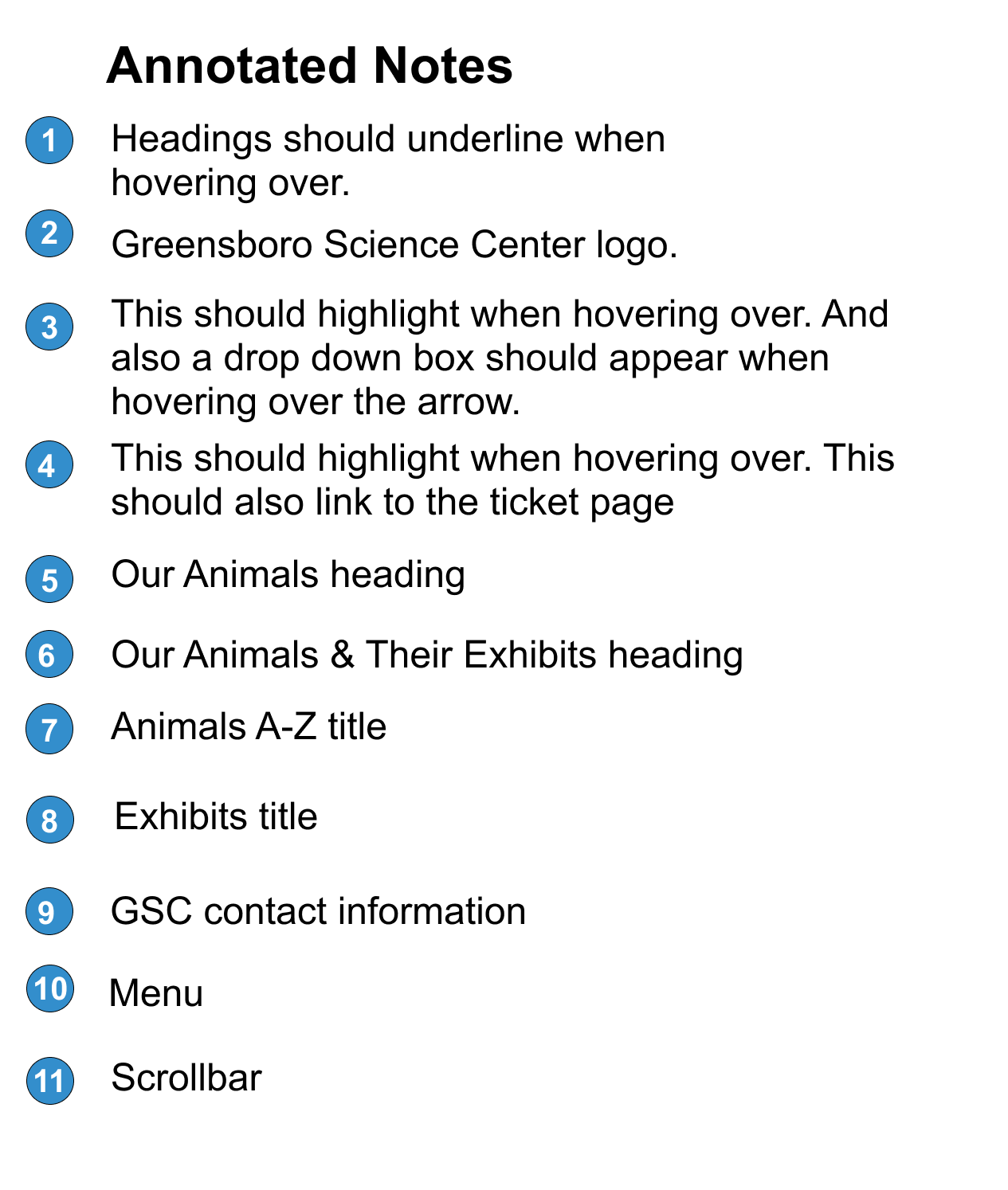
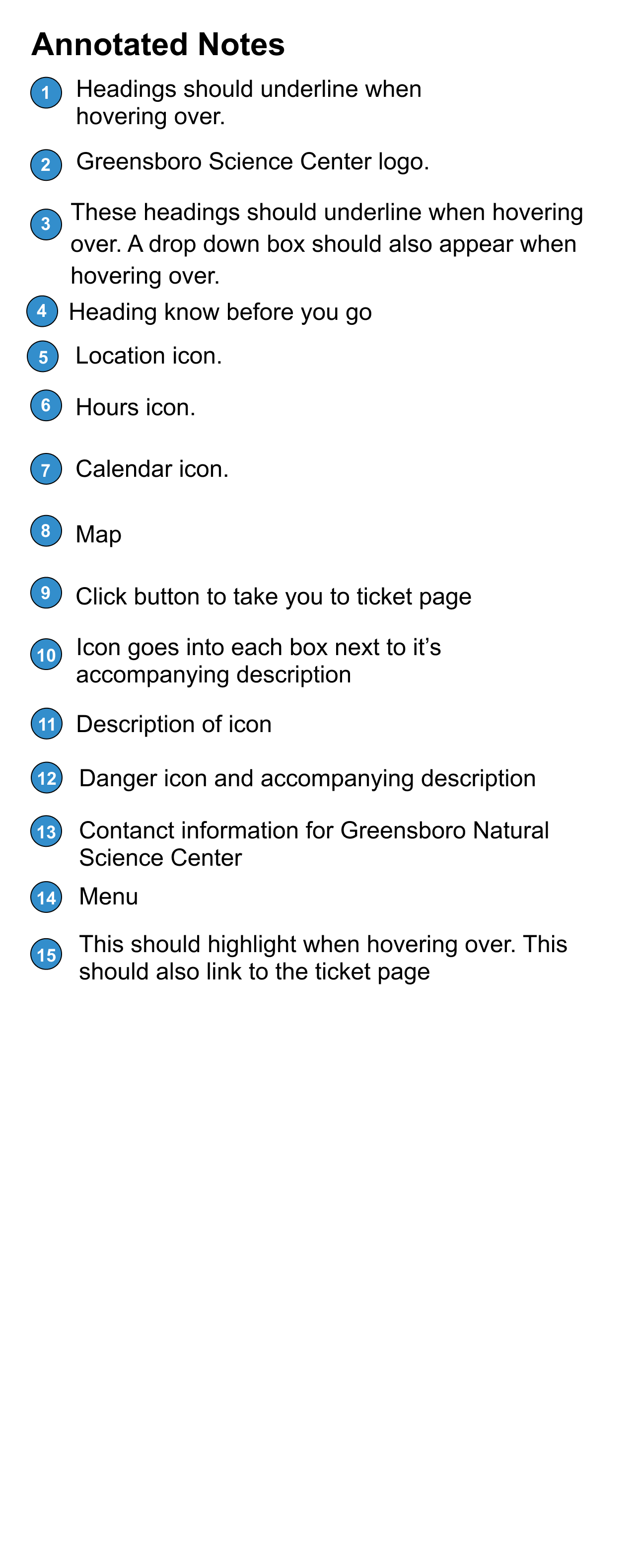
I annotated these two wireframes. The first wireframe shows the new screen I designed for the website “Our Animals.” The second wireframe shows the new screen for the two screens that I combined into one.
Preliminary Design
These are a few of the preliminary designs I created.
The preliminary design portion left me with some design issues to fix:
Contrast issues
Eliminating underlines unless something can be clicked on
Fixing text hierarchy
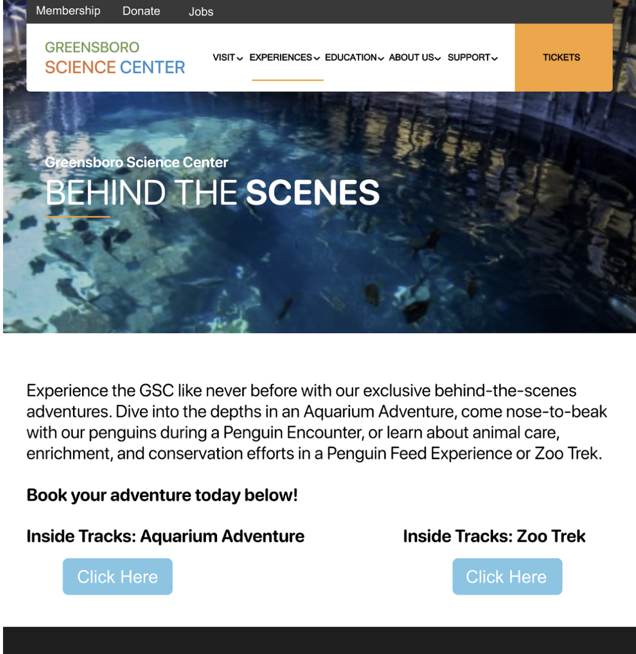
Change buttons to signal intended action instead of “click here”
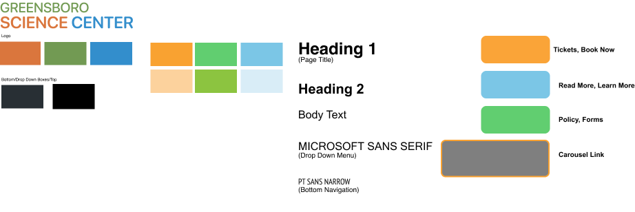
Style Tile
I created this style tile to fix the design inconsistencies from the preliminary design phase.
Stage 4
Final Prototype
I completed my final prototype and fixed the design inconsistencies from the last stage.
Stage 5
Usability Testing
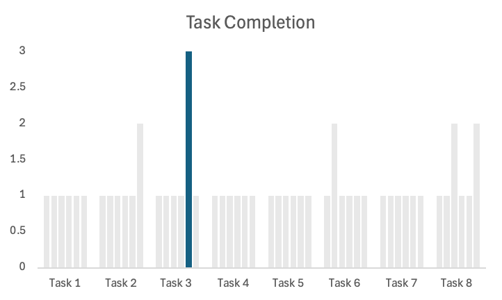
I tasked each user with 8 tasks, before the tasks began I allowed each user explore time with the prototype. Task 3 was the only task not completed and task 6 was rated the lowest among all the tasks.
Task 3: How much do tickets for members cost?
Task 6: What kind of field trips can you go on?
Takeaways:
Further reduce information on each page
Consider reordering content on pages
Make sure the most important content is emphasized

